Intermediate Class - Pastel over Watercolor

Hello Students,

I enjoyed our class yesterday and I hope you did too.  In case you want to try painting the plums again here they are, one burnished and the other with the filmy coating still on it.  
I believe you can click on the image to download it to your computer.


I painted the subject myself this morning and found that it was considerably more difficult than I had anticipated.  I apologize for choosing such a challenging subject and encourage you to hang in there while I come up with some easier subjects for future classes.

Here is my watercolor under painting.  I didn't paint the darkest plum purple dark enough but otherwise this painting was about right.

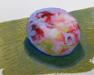
Here is my finished plum; it took 30 pastels to complete this painting.  I found that the filmy areas were pale pink, pale peach, pale orange, pale red-violet, pale violet, pale blue-violet, pale blue, and medium blue.  Phew!  You can see how a pastel artist's tableau can become very large.  


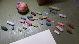
So when you buy open stock, be sure to buy pastels in value runs of at least 3 (preferably 5) values as shown in this color chart from pastel manufacturer Blue Earth.


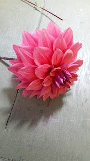
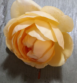
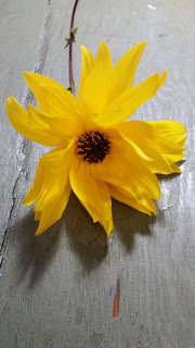
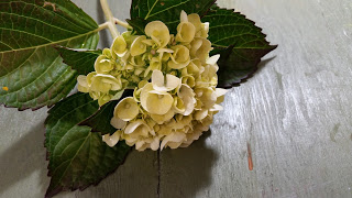
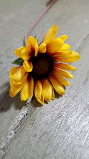
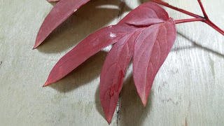
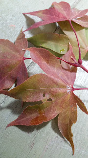
Below are some flower subjects you may use for next week's assignment.  Or, if you have leaves and/or flowers in your own yard photograph them and work from your own photos.  Remember to bring your reference photos to class next week along with your other supplies.  

Your homework is to draw your chosen subject twice (as large as possible) on a sheet of 140# cold pressed watercolor paper.  Using rich, saturated watercolors, and a loose painterly style, paint one of the images.  Bring this partially completed piece to class and we will work on them together.

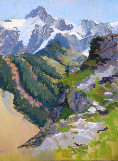
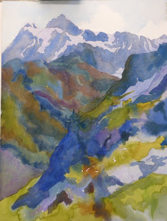
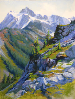
Please paint the background too, using a neutralized color will make the brightly colored flower really pop off the page.  Notice how the background in the following images has several values from top to bottom....painting your background with these same value shifts makes the image seem more three dimensional. 


Mt. Shuksan

I went to Artist's Point at the end of the Mount Baker highway last week to paint with my pals from PAWA (Plein Air Washington  www.pleinairwashington.com).

The weather on Thursday was crazy good - 68 degrees, no wind, blue sky!  I painted this 9 x 12 pastel over watercolor (on UART 400) in a couple of hours.  I knew the mid ground was too detailed, too dark and not blue enough because I couldn't make the foreground 'pop'.  I had captured enough information though that I knew I could do a good studio painting with this small work plus the photos I had taken.


A week later I laid in the watercolor under painting for my 18" x 24" studio piece.  
I was painting on 140# cold pressed Arches paper.  Unlike watercolor on UART sanded paper, the watercolor paint on paper can be quite strong and vibrant.


About 20% of the pastel has been laid in here;  I was determined to get the mid ground soft and blue so the foreground would jump forward.  After a while I took out the small plein air study and noticed that I had originally seen the rocks of the mountains as grey, not blue as the reference photos showed them; so I reworked that distant area to simplify and neutralize it.


Here is the final painting.  I like it and feel it captures the spectacular view on that beautiful day.


King Eider ducks

Simple drawing, no resist. 


Washing in the warm, soft shapes underneath
Adding Mid values
Adding feet, building deeper values in shadows

Lots of detail using smaller brushes and watercolor pencils


Finished with a suggestion of the background and the log under the pair.


Floras Lake at Sunset

This is the first in a series of paintings from our Solstice Celebration road trip where we slowly made our way down the Washington and Oregon coasts enjoying winter storms and a few bright clear days.  
Floras Lake is a long lake that is separated from the ocean by a sand dune - which is what you see in the distance.  The whole time we were watching the sun set we heard the surf in the distance.


I transferred my design onto a 12" x 18" piece of Uart 240 grit paper.


Using these Nupastels I blocked in the darkest values that I saw in each shape.

  
Next I washed the hard pastels into the support with alcohol.


Using soft pastels in lighter values I began to stroke pastel over the under painting allowing the darker paints to show through and resisting the temptation to paint detail. 


I began to add the lightest values and the details to make the sunlight appear to be really intense.


Finally I added detail in the foreground and confused the edges of the clouds in the reflection in the foreground.  

I appreciate your comments, so please let me know what you think!

Sunrise on the ponds along Three Crabs Road


On the left is the small thumbnail value sketch I used for designing the painting.  I am working on Kitty Wallis museum grade sanded paper 9" x 12"

I used hard pastels to block in the main shapes.  I then washed the painting down (one color at a time) with alcohol to create an underpainting.

I blocked in the large shapes with the darkest value I see in each shape.

I layered on mid and finally light values.

The finished piece is actually a little darker and more nuanced than this image, it's tough to photograph pastel accurately.