La Connor Baskets


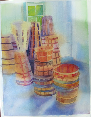
Susan Ogilvie took our class to a pumpkin farm for a plein air class last fall and I was drawn to all the shapes and styles of baskets in the storage shed.

I always enjoy laying in the initial wet in wet washes - it's the 'secret' really to glowing watercolor paintings.


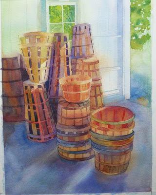
More definition, more darks and mid values.
 

I added just a few strokes of white colored pencil to regain the light on th basket edges.
Posted by Picasa

Carrie Blake Lily Pond in Sequim


First the wet in wet washes.

Then reserving the shapes of the lily pads with resist.

Next, wet in wet for the reflected trees and submerged lilies. 

Darkening some areas.

More leaf details and brighter reds.
 

Removed the resist and laid in the party colors of the sun struck lilies wet in wet.

Beginning to add pastel details using Nupastels.

Here's the final painting....I am considering redoing it as a dyptich or triptich - what do you think?
Posted by Picasa

May Heat Wave


Remember when it was 80 degrees for several days in May? 
I was out photographing the sunlit mountains and trees. 

I began this painting with a loose watercolor underpainting.  I used values that were darker than the finished painting would be and chroma that was duller and darker too; sadly, those first images of this painting in progress were lost in the ether - maybe the camera hiccoughed.  You can just see the watercolor area of the grass in the foreground.


The first pass of pastels was dark with connected, simplified shapes.

The last layers of pastel were warmer, brighter and more detailed.  I could almost feel the heat of the day! 
Posted by Picasa

Rocky's Bowls


This is a case of art imitating art...for the Sequim Arts studio tour my friend Rocky Fankhouser displayed a couple of his beautiful turned wooden bowls on his hand painted table right in front of a cascading clematis on  a sunny July day. 

As always I started with a few thumbnail sketches to work out the value pattern of the piece, then I transfered the drawing to a piece of 16" x 21" 140# cold pressed Arches watercolor paper. 

Since it's critical to have the ellipses accurate, I used a piece of vellum to copy one side of each bowl then flipped the vellum over and traced the other side.


To me, the most intriguing part of the scene is the light and shadow on the table and bowls, so I started the painting there....if that part didn't work I needed to start over.


I added just enough information to the table to 'reserve' the shape on the paper...I have been known to forget where major elements go in my zeal to paint the background.


Next I added the first layer of wood detail to the bowls and  washed in the clematis blooms and leaves - very wet and intense.

After I darkened and simplified some of the clematis leaves I removed the resist and began cleaning up some of the hard edges left by the resist.

Here is the finished painting...I hope Rocky likes it - and you too!

Posted by Picasa

Sea Stacks at Second Beach


I wanted the stacks to "belong" to the sky and to sit back in the distance, so I washed the sky color over them.  I painted this portion upside down so the darker color would flow to the top of the paper.
  You can see a small amount of resist holding the white foam of the waves.

Here I have begun painting mid-values wet-in-wet in fairly large areas, trying to keep the paint loose.

I added at least one layer of watercolor to every part of the paper before adding any pastel.


For me, the 'story' was about the reflected sky, stone, and tree colors in the wet sand and shallow water.  The finished painting is 16" x 25"
Posted by Picasa

Heceta Head Lighthouse


I used a full sheet of Arches paper for this painting.  Here I have reserved the whites with resist in preparation for the first wet in wet washes.

I had a great time sloshing in all the juicy colors with a 2" flat brush; the resist acts like a dam keeping the colors from mixing where I don't want them to.


On the left is a muffin tin of the large pre-mixed colors I used.

I have laid in a second wash of darker values, still using the resist to help isolate colors from each other.

After I removed the resist I stroked soft pastel over almost everything to lighten values and add lots of interesting color combinations.
Posted by Picasa